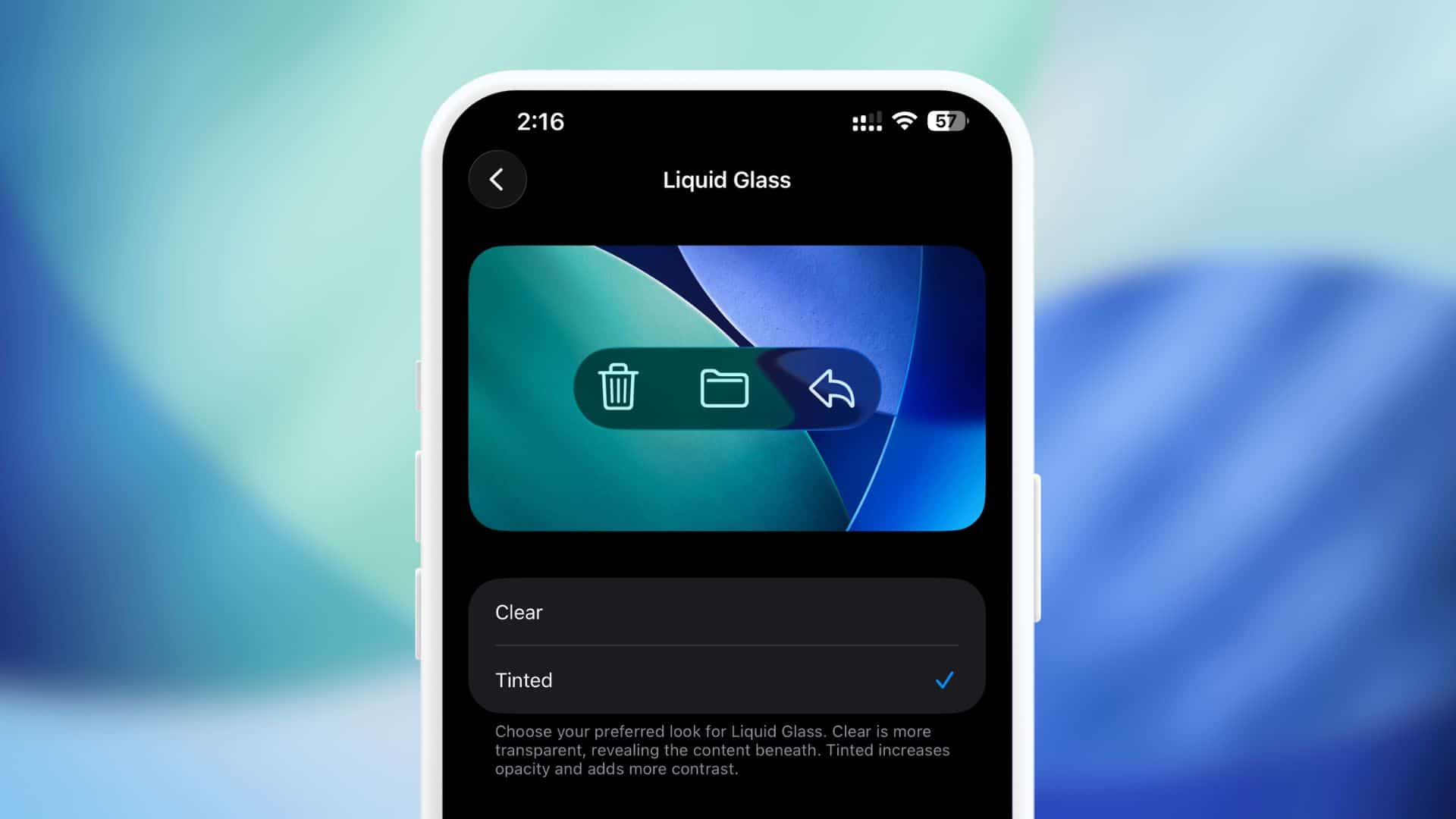
This new setting, found under Settings > Display and Brightness, allows users to choose between the original Clear (more transparent) look or a new Tinted option. Selecting the Tinted option significantly increases the opacity and contrast of the Liquid Glass elements across the system, including menu bars and Lock Screen notifications.
A Great Improvement, Though Not the Final Word
This addition is a great improvement and a clear sign that Apple has listened to the critical user feedback from the community. By offering a straightforward switch to a more opaque and less visually aggressive interface, the company has directly addressed many of the sensory processing and visual clarity issues that plagued the initial OS 26 experience.
While the consensus among many accessibility advocates is that the true ideal would be to see no aggressive layout shifts or distracting visual movement at all, this transparency toggle immediately makes the operating system more usable for a large number of affected users. It provides a much-needed compromise, balancing Apple’s aesthetic vision with the functional demands of accessibility, allowing users to restore stability and contrast to their interface without having to sacrifice device performance.
If you are looking for misophonia coping skills, you can go here to see coaching (worldwide) and here to see therapy (Canada) options with Shaylynn Hayes-Raymond. Shaylynn also offers both live and on-demand webinars for misophonia.